« October 2006 | Main | December 2006 »

November 21, 2006

Austin's Sitter

Since Austin doesn't get along well with cats, the last couple of times I have been out of town (Tybee and Dallas) he has stayed with my friend from work, Jenny, instead of with Katie at Susan's house. She absolutely adores Austin and pampers him beyond belief while he stays with her. One time when I went to pick him up she told me how much Austin likes ham and eggs with cheese on top. Her two boys help take care of Austin as well, taking him for several walks a day. He gets constant attention all the time, which he just adores.

Jenny likes Austin so much that she asked if he could stay over this weekend just so they could see him again. So I packed up his bag and took him over on Friday. On Sunday Jenny called and said her family had taken a vote and it was 3-0 to keep him for another day (Jenny telecommutes on Monday so she would be home all day with him).

Last night I went to pick him up. I noticed Jenny had a bruise on the bridge of her nose. I asked her what happened. Apparently Austin was on the couch next to her when one of Jenny's sons slammed a door or something, causing a giant bang. This startled both Austin and Jenny and Austin wound up knocking into Jenny's face pretty hard, breaking her nose. This was on Saturday and I think the reason she wanted to keep Austin another day was because she had missed out on being with him most of Saturday, what with the trip to the emergency room and everything.

Austin is back with me now, but it will be several weeks before Jenny heals up from his visit.


November 14, 2006

Graffiti is back!

The main drawback of owning the new Palm TX was that Palm had to abandon the Graffiti handwriting recognition system for Graffiti 2, which was awful. After exploring alternatives and getting excited about my new keyboard, I drug out my Palm VX to do a speed comparison. On the first try I got 24.7 words per minute (after weeks of practice I was up to 23.3 wpm with Salamander writing the most common words, for which it is optimized). Wow. Plus I realized that with myKbd I had to look closely at the keyboard to tap the right keys, but with Graffiti I can look at what I am copying down and not look at the Palm.

So I went back and looked for the files. I found some updated files dated in April 2005. Before installing them I did a Hot Sync to back everything up (with the other files my Palm wouldn't boot and I had to do a hard reset, wiping out its entire memory to get it to work again). Then I put the files on the SD card, moved them over to the Palm, and did a soft reset. It took a while to boot and I thought it was frozen, but then the prefs screen popped up! I was in business. It is even compatible with myKbd, which just replaces the old Palm keyboard.


November 7, 2006

Salamander

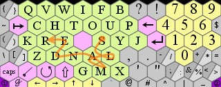
After making what I thought was a much improved myKbd key layout, I found out why the other designs put the space in the middle. In a separate e-mail (and in the options in the program), Alex pointed out that if you are sliding through letters (rather than pecking them) and you run across the space key in the middle of the word, the space is ignored. This opens up a lot more digraphs and trigraphs since now you can slide from E to 8 other letters (instead of 5 on Metropolis if you ignore this feature or 6 on my layout). In fact, all of the letters that touch the space key have 8 letters they can go to, and they are all very common letters. The stylus travels further than if they are touching, but you still get to slide which I think may provide a speed advantage.

salamander

If I give those key combinations one point then Metropolis goes from 14 to 21 (out of the top 30 digraphs and top 15 trigraphs for a maximum score of 45), QUONG goes from 17 to 25, and because my space key is off to the side I stay at 24. I came up with a new design taking advantage of this feature and it has a score of 20/29. More on that later.

The IBM guys' system, called ShapeWriter, is a little different since it involves always sliding and you just run right over letters that get in the way. The software then figures out what was supposed to be ignored. Tht mks m thnk myb y cld lv t vwls whch wld rdc typng tm sbstntlly. Th sftwr wld pt th vwls bck. Also they don't put a space key in the middle. I think it just puts a space anytime you pick up the stylus.

So if you can use some intelligence in the software you could improve typing speed. Some phones do this using the number pad by letting you press the numbers and then figuring out which of the three letters on that key were appropriate: 8428 is tuv-ghi-abc-tuv. It could be spelling "vibu", but is probably spelling "that" so it chooses that. Dial by name directories on phone answering systems use the same principle.

Also, Alex mentioned possibly augmenting the controls of myKbd to allow your other hand to press some of the buttons on the Palm for things like shift, spacebar, and backspace. This would mean overriding the function of that button, but would only apply while the stylus was in the myKbd area. It would be an interesting future upgrade if he could get it working.

Today I found a review of Fitaly that had a link to an Army code-breaking manual. It's pretty dated I'm sure, but it has appendices with every digraph (in a grid of letters, so they ignore the order of the two letters), and then a list of most common trigraphs and quadgraphs. These were compiled from 50,000 letters in military telegrams. It is funny because "the" doesn't even show up as a common word since telegrams always leave out "the". Plus by the time you get to the quadgraphs you start seeing that military language isn't the same as regular language and most of the quadgraphs are parts of numbers that have been spelled out. It was still kind of useful for tweaking the key layout since I could see which were the more useful combinations when deciding whether to swap two keys (this led to me switching u and f at the expense of the very uncommon iu combination and opening up i and f which is more common, but not a top 30 digraph).

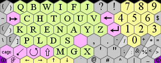
Back to my design . . . What I found out was that Metropolis is actually a pretty decent design given that whole crossing the middle thing, but there was still room for improvement. The three most common vowels are e, a, and o, so I feel like they belong on the center ring. The three most common consonants are t, n, and s. So those six go on the main ring alternating vowels and consonants. "The" is the most common word so t and e should go next to each other and h should go between them in the second ring. Then you start looking at the different digraphs and trigraphs and trying to figure out what you can put together. Because e is the most commonly used letter, you want to optimize it by putting it with strong consonants. er and re are both in the top five digraphs, so put an r next to e. ed is another popular one, so put that in and you've filled up e's neighbors. t is the second most popular letter so give it i. And put that near o because that opens "to" "it" and "tion". I wanted to be able to write the second most popular word "and" in one stroke, so that meant putting a and n together on the ring near e which wanted to be close to d.

With h up in the corner I surrounded it by other consonants that pair with it: c, p, and w. That also allows popular words "when" "where" and "with" to be produced with one stroke. I had s next to h for a while with r on the main ring, but changed my mind. Even though having r on the ring instead of s boosted the score of the layout to 21/30, I thought it was best to keep e and r close. Since "you" is a very common word and ou is a common digraph, I wanted u next to o. Also I wanted f next to o because "of" is so common. I put the y near o and u, but couldn't make it so that you could slide your way through y-o-u. I couldn't put i-n-g together, but I could at least put g next n. q, z, j, and x are all on the outskirts. For a while I had q with u, but q is used so infrequently that u is better off being with o.

Anyway, that's what I wound up with. I am getting better typing speeds already, with 23 words per minute on "Now is the time . . . " I'm still not sure if crossing the space key is worth the sliding distance. So I will keep my old layout just in case or maybe make some further improvements to it. Palm file (or in classic colors) and source file.


November 5, 2006

Graffiti Alternative

I've been pretty frustrated with my new Palm TX's Graffiti 2 software for inputting text. With the old Graffiti I could get about 20 words per minute (a word is 5 keystrokes, including spaces). That's a lot slower than I can type (60 wpm or so) but in a pinch it lets me write fast enough that I don't usually forget what I'm writing about. With the new Graffiti I am getting 10 words per minute. I could probably get that up to 15 with practice, but it is still slower since some letters are now two strokes (f, i, k, t, and x) and others are easily confused like u and v. So I'm also getting lots of typos.

On the Brighthand website (kind of like iLounge for handhelds) people mentioned a program called MyKbd by Alexander Pruss. It turns the writing area into a screen of hexes, each with a letter on it. You tap the letters you want, just like on a keyboard, but he has made it faster than a keyboard by putting the most frequently used letters next to each other, optimizing it for people using a stylus. He took it further by letting you slide from one hex to an adjacent one. Naturally he put t and h next to each other so you can just slide from the t to the h and "th" appears on the screen. And e is after that so that you can write "the" with one well-placed stroke.

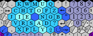
Some IBM engineers used computers to optimize the layout of the keys with the following result, called Metropolis:
kbd-metro.gif

Supposedly having the vowels in branches makes it easier to navigate (hard to believe any engineer would put the . so far from the numbers though). The MyKbd author came up with his own version which put the infrequently used letters in somewhat alphabetical order to make those easier to find. I guess once you get trained you don’t have to hunt and peck but just kind of know where things are.

I've been learning Metropolis for a couple of days. I downloaded a game called Fitalyletris that helps you practice writing. It was written for another (non-hex) keyboard called Fitaly because one row of it spells out that odd word. It too has been optimized and supposedly lets you type 50 wpm, but I have doubts (fitaly was originally made as a sticker that you put in the graffiti area, but now the Palm TX graffiti area is an extension of the screen so you don't need an overlay). The hexes have an advantage in sliding to adjacent letters because a hex touches six other letters whereas a grid can only touch four. Other sources said that MyKbd had a slight advantage over Fitaly. With an optimized keyboard you really don't want to practice "The quick brown fox" because that sentence uses all the infrequent letters and is probably the slowest thing you could write. Instead Fitalyletris has different games that drop the most common words. Using this I was getting up to about 16 words per minute, but still getting some major delays learning the layout. At least there were a lot fewer typos. And there were a lot of words I found that could be done with one slide: "which sand of theirs play land not terse where plan to hire thick monday as the fond." With those words I could get 20 words per minute.

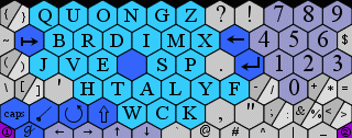
I still thought it could be better optimized. I found a guy who had worked on hex screens independently and later found MyKbd. He had created a new MyKbd layout that he called QUONG (as opposed to QWERTY). He pointed out that it was more optimized than the layouts that came with MyKbd and that he had run his own analysis using the most popular digraphs and trigraphs, which are 2 and 3 letter combinations that appear in words. I found the 10 most popular digraphs on a code-breaking website: th, er, on, an, re, he, in, ed, nd, and ha. The 10 most popular trigraphs are: the, and, tha, ent, ion, tio, for, nde, has, and nce. By the way the most common words are: the, and, of, to, I, a, in, that, you, and for.
kbd-quong.gif

I could score each system by how many of the top digraphs and trigraphs have adjacent letters. If I do that with the top 30 digraphs and 15 trigraphs, I get a score of 14 for Metropolis. Quong gets 17 and my new design gets 21. One way I was able to get more points was by getting the space key (the blank one) out of the way. I admit the space is used more than any other key, but because of that you learn where it is pretty quickly and can get used to tapping it at the end of each word. I feel like that will work better. By moving a couple of letters I was able to get the score up to 24.

After figuring out why I couldn't get the keyboard generator to work (it couldn't create an out_data directory on its own, so I made the directory and everything worked great), and debugging my design, then playing around with the color scheme, I finally got my keyboard working. I used more muted colors and made it less contrasting by making the borders gray (after reading some posts at 1src I found a site that lets you play around with keyboard designs which lets you see the layout faster than compiling it). The first time I tried to test my speed I realized I had left off Y. At least that's what I thought for a while, but I finally found that it was there, it was just the wrong color (part of the debugging). I still managed 11 words per minute after spending all that time looking for Y (using another program called WPM to test typing speed with "Now is the time . . ."). Once I fixed that, I ran another test and got a high score of 16 wpm. I did it again and got 17 wpm. I'm liking it! If you want to try it, here are the source and Palm files (another version in classic colors).
kbd-ted.gif

Part 2

P.S.: The picture and files above represent a tweaked version of my original layout. It has a score of 25 by moving the u near o and a couple of other changes.

November 1, 2006

Best Buy Commissions

Lately my Amazon sales have been way down because they ran out of the most popular battery pack. Their affiliates sold them, but at higher prices and sales went way down. Best Buy was selling the same thing for $20, so I thought I should see if Best Buy had a commission program. Sure enough, they did. I went ahead and signed up but I soon realized that it was just Commission Junction with a Best Buy face on it. Like CJ, the commission was only 1% instead of the 4% minimum that Amazon gives me. They would pay once I reached $25 but that meant I would have to sell 125 $20 battery packs to ever see a payment. Since I had sold 58 of them through Amazon last quarter, I figured maybe I had a shot if I were patient. Plus I could get some additional revenue if people bought extra stuff while they were browsing Best Buy's web page.

Oh well. I tried it for two weeks. I sent a decent stream of visitors to Best Buy's website, with 104 clicks in 17 days, or about 6 a day. It would have been nice if that had resulted in about one sale a day, or one every other day. But during that time I got absolutely no sales. Even if I got my first sale tomorrow, that would mean only one sale every 18 days. That means it would take over six years to make $25.

I think the problem is that people don't order stuff from Best Buy's web page, they just go visit a store. So, once again, I gave up on that scheme and reverted to direct links. I will ask Best Buy to remove me from their service.