Color Wheel
I have inherited webmaster duties for a DOT employees organization. For the most part the site is very neglected, somebody put a lot of effort into it one time and then nothing really came of it. It also uses frames. The problem I have with frames is you never really know where you are and in this case there are eight different local branches of the club, plus the statewide organization. The colors and buttons are kind of simple. I thought using I could use a format kind of like what the blogs use where there are two columns, one for links and one for content. But I'm terrible with colors and didn't just want to use Vicksburg Olive like my blog does, even though I like the way those colors work together.
I found a neat website that offers a color wheel. It may be in different places because they guy says he will let you put the source on your own page (with ads), but this is where I found it:
You pick any color by changing the Red, Green, and Blue values and it comes up with a palette of complimentary colors usings that color (or something close to it, really he rounds everthing off so that you are only choosing from 4,000 instead of 16,777,216 colors).
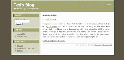
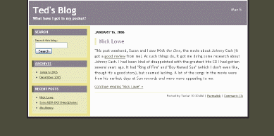
So what I did was took the Vicksburg theme CSS, then added in the basic CSS to have everything in one file. Then I took a snapshot of my blog page and used LView to tell me what the different color values were for the background, text color, etc. There are about 8 colors used. Then I went to color wheel and picked a scheme I liked and wrote down 8 color values that I wanted to use, trying to match them up with my blog snapshot. Lastly, I opened the CSS file for editing and did a find and replace for the original color value and replaced it with the new color value. I'm sure that as uncomplicated as my example is that I didn't need 90% of the CSS that was in the file but it was easier to do a global replace than edit the sheet (it was enough trouble putting the module column on the left instead of the right).
The original:

The new color scheme:

I posted some test pages at the original site. The first is based on Vicksburg Olive, the second on the new one above, and the third is another one I came up with later. I have modified the style sheets to take out most of what I don't need and renaming some of the classes to be more appropriate to a web page. It was all very confusing, but the results look pretty professional, I think.
Comments (8)
I like option 2 if only because the links on the left have a higher contrast than option 3. I've been wondering about the vertical bar that leads a subject in the new MT styles. I guess it acts as a bullet? Isn't the largeness and colorness of the text good enough? It is probably cool, though, so you should keep it.
Posted by Jeb | January 22, 2006 11:31 PM
Just looked at the original site design. YIKES! Any three of your options are a huge (and professional) improvement!
Posted by Jeb | January 22, 2006 11:32 PM
I wonder about that little vertical bar too, but I like that fact that because it is a piece of border that there isn't a separate image that has to be downloaded. I think I might be able to make all new pages next weekend and be rid of the old site. I might try a few more color combinations. The color wheel tends to yield a lot of dark colors or a lot of light colors so you don't always get a good mix and contrast is hard to come by. I suppose I could try making some of the colors lighter, but I was trying to stick with what they gave me.
None of this is all the critical since the website doesn't get that many visitors and the content isn't updated very often, but I didn't want to leave it the way it is.
Posted by UT | January 23, 2006 7:51 AM
I like the first one better. One suggestion, however, is that I think you should bold the font on the left side of the page to make it stand out more. The logo at the top left should have a lighter shade of green becaue it is too hard to read.
Nice format, though.
Posted by Mom | January 24, 2006 2:35 PM
I like burgundy and taupe combinations myself. Of course burgundy leads into shades of pink which is my favorite color. Furthermore, it is my belief that the little green and yellow circle in the upper left corner would look striking against a taupe background. Not unlike your third choice, and yet all together different.
Posted by sista | January 25, 2006 10:15 AM
I posted the new web pages today. The colors look darker on my work computer than my home computer. There is a whole catalog of clothing items they sell that I didn't change because it involved a lot of re-sizing pictures and re-writing forms that I'm not sure are worth updating.
Posted by UT | January 30, 2006 10:11 AM
This looks really good! I even like the little sub-page navigator you put in at the top, borrowing from the Prev | Main | Next control in MT. I hope you get some recognition for this. Or better yet, a free lunch.
Posted by Jeb | January 30, 2006 12:39 PM
I borrowed everything I could from MT. It's a pretty good system, but it's a pain doing all of that by hand (eventually I got the code pretty easy to understand though, so I think it won't be bad to update it). The church website idea as being a blog started to look attractive, except I doubt there will be many changes.
You can also preview the hat page from the catalog compared to the current page
Posted by UT | January 30, 2006 1:21 PM